


The flexbox is the most powerful design pattern in CSS. If you are familiar with Grid then you heard about flexbox design patterns or used flex-box in your design.
To achieve flexbox you need to write just one line of code
display:flex;
By default, display: flex has a default property of row. You can change it by using
flex-direction:column;
let's drive into the design patterns of flex-box
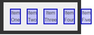
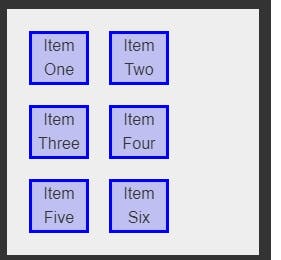
- flex-wrap The flex-wrap CSS property sets whether flex items are forced onto one line or can wrap onto multiple lines. If wrapping is allowed, it sets the direction that lines are stacked.
In simple words, you will save lots of time while doing the same thing by using @media query
flex-wrap: nowrap;
flex-wrap: wrap;
flex If you want to achieve grid in structure by using display flex property then you should check out flex property
display:flex;
flex: 1 1 33%;